How many tokens do you burn, on average, building a website with your favorite AI? I don’t have an exact count, but I was going through about two full sessions’ worth of tokens with Claude for every single page.
Yes, I know, that’s way too much. But that’s how my workflow went: I’d ask Claude for something, it would generate something close to what I had in mind, I’d ask for a tweak, that tweak would break something else, I’d ask for another tweak, and the cycle repeated until I ran out of tokens or patience (sometimes both at once). Not the best way to use a tool that’s supposed to make you faster, and that’s exactly why I’m writing this.
For months I’d been thinking about how to work better with Claude without filling every conversation with endless prompts and corrections. I wanted a framework that would let me iterate effectively and land much closer to what I had in my head.
As a designer, I think very visually: hierarchy, proportions, what goes above the fold, how a section breathes. A language model like Claude, on the other hand, “thinks” in text. It doesn’t form a mental image the way I would, or the way you probably are while reading this. So when we ask for something like “create a modern landing page with a powerful hero and a bento services section” (I know it’s not the best prompt, but it works as an example), we’re letting a model that thinks in text decide the site’s architecture, the layout of every page, and the entire look of the landing page. Three design dimensions in a single message.
The problem starts when I don’t like some of it, because the feedback comes mixed too. “The hero feels too heavy” (again, just an example) can mean a lot of things: too much content, the wrong grid, or a color that’s too dark. The AI doesn’t know which dimension to touch, so it touches all of them. And that’s where the loop begins.
So if the problem travels mixed together, shouldn’t the solution be to separate those dimensions? My hypothesis is that it should. Giving the AI one source of truth per dimension should let me work far more precisely, so that every change has exactly one place to live. If structure, layout, and aesthetics are each defined in their own file before the AI writes a single line of code, the build should be much faster, iteration simpler, and the model should have much less room to improvise.
I named the framework that came out of this hypothesis after the biology of our own bodies, because it describes pretty well the order in which decisions get made: Skeleton, Bones & Skin. And honestly, as I write this, I don’t think I could have named it better.
The idea is simple: each file owns a single dimension of the design, and none of them steps on another’s turf.
SKELETON.md is the architecture, the skeleton that holds everything up. This is where I define the site’s routes, which business goal each page serves, which sections it’s made of and in what order, how the user moves between them, and who has access to what. It’s the sitemap, but with intent.
BONES-[page].md are the wireframes, written in markdown. If the skeleton says which sections exist, the bones say how they’re laid out in space: grids, splits, bentos, how much content fits in each block, what makes it into the first screen, and how everything rearranges on mobile. No colors or typography here, just structure. There’s one file per page, plus a shared one for what repeats across the whole site: header, navigation, and footer.
SKIN.md is the skin, the design system. Colors, typography, borders, shadows, spacing and, something we almost always forget to ask the AI for, the states of every component: hover, active, focus, disabled and, in forms, error. It’s basically a design.md under a different name.
So what changes in practice? Feedback stops being ambiguous. If I don’t like the structure, I edit BONES. If I don’t like the look, I edit SKIN. If I’m missing a page, I start with SKELETON. The file I open already tells the AI what kind of change I’m asking for, and it no longer has to guess whether “the hero feels heavy” was a grid problem or a color problem.
Now, writing these files by hand every time would be as exhausting as the loop I was trying to escape. So I turned the method into four skills, one for each step:
- skeleton-generator takes the business intent and writes the SKELETON.
- bones-generator takes a route from the SKELETON and writes its wireframe.
- skin-generator defines the design system.
- layout-orchestrator reads all three files and builds the code.
The orchestrator is the piece that closes the loop, and I want to stop on it for a moment. It knows which file has the final say on each type of decision, it reads the project before writing anything, and it always builds in the same order: tokens first, then components, the shell, sections, states, and finally routes. But what I value most is something else: when it has to fill a gap or finds two files that contradict each other, it tells me instead of quietly resolving it on its own. At the end, it checks the result by rendering the page on desktop and mobile.
Now, to be 100% honest, I had a little help. The concept took shape in a conversation with Gemini. I went in wanting a way to keep the wireframe in an .md file, and came out with the three-file split and the idea for the four skills. Then I moved over to Claude to refine them.
With the method ready, I built my agency’s entire website, reactiv.site, in two runs and in less than one session of tokens. Yes, the same person who used to burn two sessions per page.
To show what that means in practice, here’s the home page hero in its BONES file (shortened a bit):
### Hero
- Layout: desktop: headline spans all 12 columns; below it,
  value proposition and both actions in cols 1-5 and the site
  mockup in cols 7-12 (4:3), top-aligned with the value proposition.
- Content: eyebrow (max 5 words); headline (max 7 words, lowercase
  statement ending in a period); value proposition (max 15 words);
  Book a call (primary); Free audit (secondary).

DESKTOP
+------------------------------------------------------------+
| / design & web studio                                      |
| websites that bring you customers.        (HEADLINE, 12c)  |
| VALUE_PROP (≤15 words)     |    +-----------------------+  |
| [BOOK A CALL] [FREE AUDIT] |    |  SITE_MOCKUP 4:3      |  |
|  cols 1-5                  |    |  cols 7-12            |  |
+------------------------------------------------------------+
And here’s how it turned out in production:
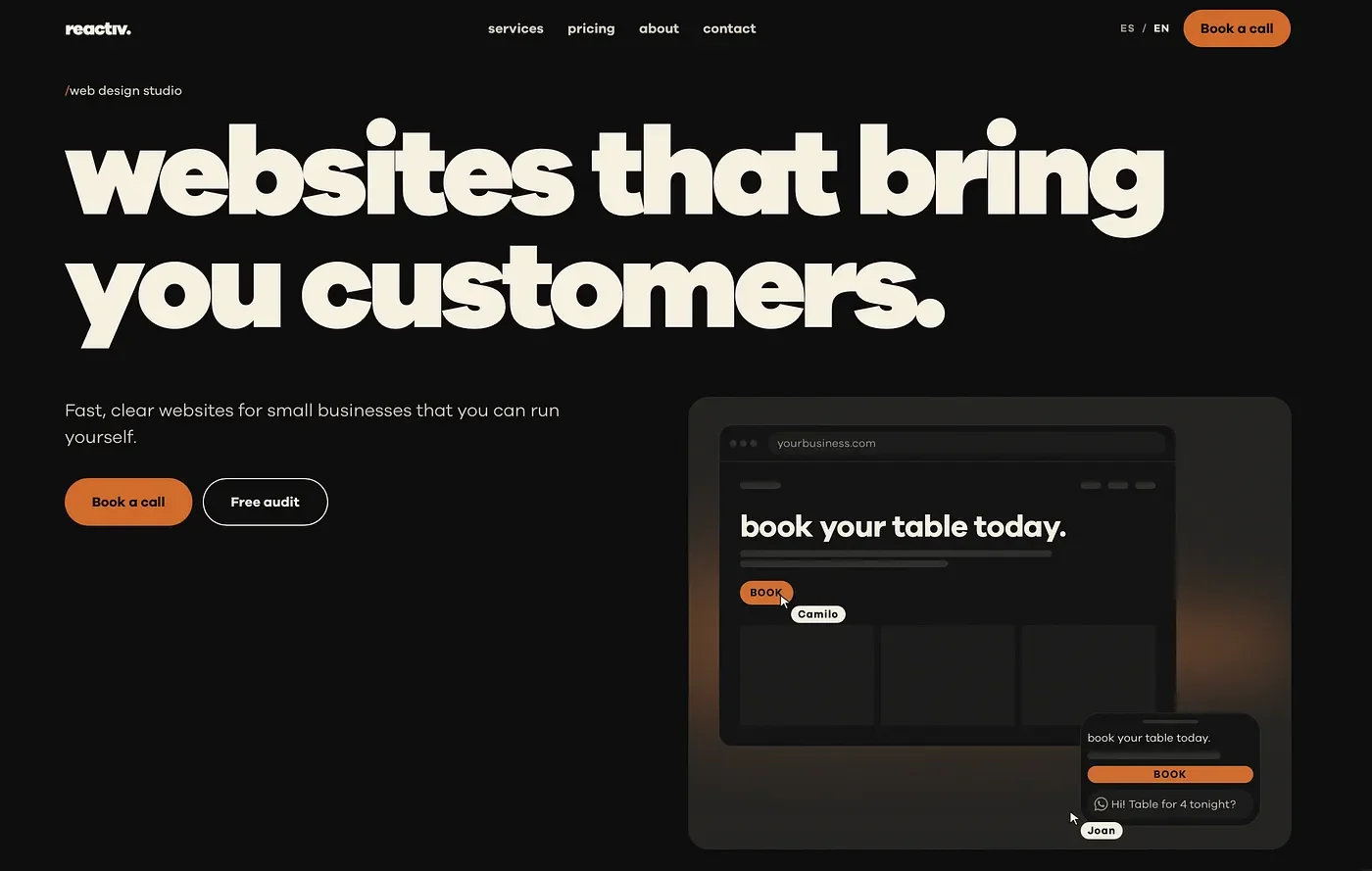
The headline spans all twelve columns, the value proposition and buttons live on the left, and the mockup starts on the right, aligned with the value proposition. On mobile, the buttons stack full-width and the mockup peeks in right at the edge of the first screen, just as the file asked. I didn’t have to negotiate any of that in the chat. It was written down.
Now, I want to be honest about what this proves and what it doesn’t. It’s one case, mine, on a project I know by heart. The tests for the SKELETON and BONES generators used a single run per version, which is enough to see clear improvements but not enough to claim that two versions perform the same. The orchestrator and the SKIN generator haven’t been through that same process yet. And when we rewrote the orchestrator, we deliberately removed the “pixel-perfect” and “100% deterministic” promises it had at the start. The AI still interprets; the difference is that now it has much less to guess.
There’s also some friction I haven’t solved yet. SKIN and BONES use different default breakpoints (720 and 768 pixels), and the responsive part of SKIN overlaps with what BONES already defines. That’s exactly the kind of overlap the method is trying to eliminate, so both are at the top of my list, along with testing the orchestrator and the SKIN generator with the same rigor as the other two.
But if I had to keep just one thing from this whole experiment, it wouldn’t be the speed. It would be realizing that the problem of iterating with AI looks a lot like one we designers already know how to solve: separate responsibilities, document decisions, and keep one source of truth for each thing. We make wireframes before designing in high fidelity for a reason, and it turns out AI needs those reasons too, just in a format it can read.
So if you design or build websites with AI and recognized yourself in the loop at the beginning, try separating before you ask. Even if you don’t use these skills, writing structure, layout, and aesthetics separately already changes the conversation.
Written by me, then edited and restructured with AI. Originally published in Spanish on Medium; this English version was translated with AI.